
How to Style Dining Room Wallpaper


Dining rooms aren’t usually where you find bold prints and patterns. So when you’re working with wallpaper designs for your dining room, there are few things to keep in mind. Stylist Melanie McLaws shares how she designed around this playful dining room accent wall.
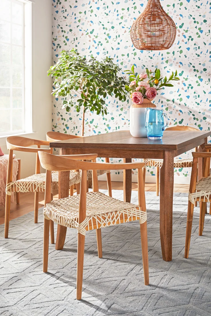
Pick a Solid-Colored Rug

When you’re choosing an area rug to pair with your dining room wallpaper, go with something simple. I focused on the dusty pastel colors in the terrazzo pattern, and pulled a single pale blue for my rug. I love that the print is reminiscent of the colors of flowers that have been hibernating all winter. And because the rug only uses one color, it won’t compete with the whimsical wallpaper.
I also chose this area rug because it has different pile heights. Essentially, this means the length of the rug fibers varies. That texture gives the rug some depth, providing the perfect amount of visual interest. It’s eye-catching without feeling overwhelming. The lively wallpaper is still the dining room’s statement piece.
Check out our guide on How to Choose the Perfect Rug Color for more details.
Play With the Size of Your Patterns

With a bold dining room wallpaper, it’s important to pay attention to scale (the size of your pattern). The negative space in the terrazzo print lends itself to an airy and open feeling. But the size of the pattern feels full, so for balance, I chose chairs and a bench with a simple woven element. The tight knit gives the illusion of a small print, while the pattern on the rug reads as larger. Scaling pattern throughout the space ensures they’re not all fighting for your attention. By keeping the wallpaper on one wall in the dining room, the terrazzo is impactful, but not chaotic.
See our guide on How to Mix and Match Pattern for more tips.
Stick To Clean Lines & Classic Shapes

If your dining room wallpaper has multiple colors and shapes, go with sleek furniture. Avoid overly detailed pieces like woods with deep grains or ornate carvings. Your wallpaper pattern is your main feature, so don’t add visual clutter.
I chose Mid-Century Modern pieces for their smooth lines and neutral tones. Take this dining table and wishbone chair. They blend when placed against the patterned wallpaper. But with subtle curves, simple bases, and low profiles, they don’t get lost in front of the terrazzo backdrop. The sideboard is another good example: crisp white color, clean hardware, and post legs. It doesn’t clash with the wallpaper, but stands out against the deep green wall.
See our full guide to Mid-Century Modern Furniture & Decor Ideas.
Scatter the Wallpaper's Accent Colors

To use wallpaper for a feature wall, you should pull in some of the more subtle colors around the room. A cohesive palette always ties everything together. With that in mind, I brought out the terrazzo’s pinks and blues using decorative accents. The water pitcher, throw blanket, and floral artwork highlight the wallpaper’s toned-down colors. Otherwise, these may be less noticeable.
I also carried over the wallpaper’s saturated colors to create a bold statement wall. Referencing the print on a second wall helps the room feel “bookended” in a way. While it adds interest, it harmonizes with the dining room’s wallpaper.
Choose Lighting With Simple Structure

When your dining room wallpaper has a pattern that’s more free-flowing and organic, balance that out. You don’t want a busy light hanging against a busy wall. It looks tangled. A fixture with multiple arms and accessories, like a chandelier, is too elaborate. Just like with the dining set, focus on defined shape and texture for your lighting. You’ll find simple structure in most pendants, such as a round globe or basket light (shown here).
See our guide to the Best Light Fixtures for Your Dining Room.
Now that you’ve chosen wallpaper for your dining room wall, check out Dining Room Decorating Ideas to get even more inspo.
Share This Guide


